- Be aware of limitations on human perception and cognition (Stevens' power law)
- Choose appropriate marks and visual channels for representing different data categories. This requires us to understand properties of the data, properties of the image and rules of mapping data to image.
- Be aware of data ink ratio and avoid chart junk
- Allow/encourage exploration
- Reduce clutter
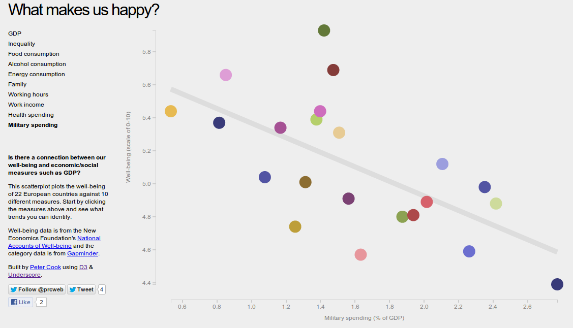 |
| What makes us happy |
http://prcweb.co.uk/lab/what-makes-us-happy/
Here the author allows users to explore data by clicking on different economical/social measures such as GDP. It makes good use of colour and area to denote different countries. Good separability between data items (countries). When you hover above the circles the country name is displayed. The limitations are there is no way of comparing different social measures e.g. compare working hours and work income. The data points are don't move vertically since GDP is fixed but going back and forth between two social measures and trying to work out how two or more countries differ is not very apparent.
One needs to hover on the circles to know what country it represents and there is no labelling that can be switched on and off.
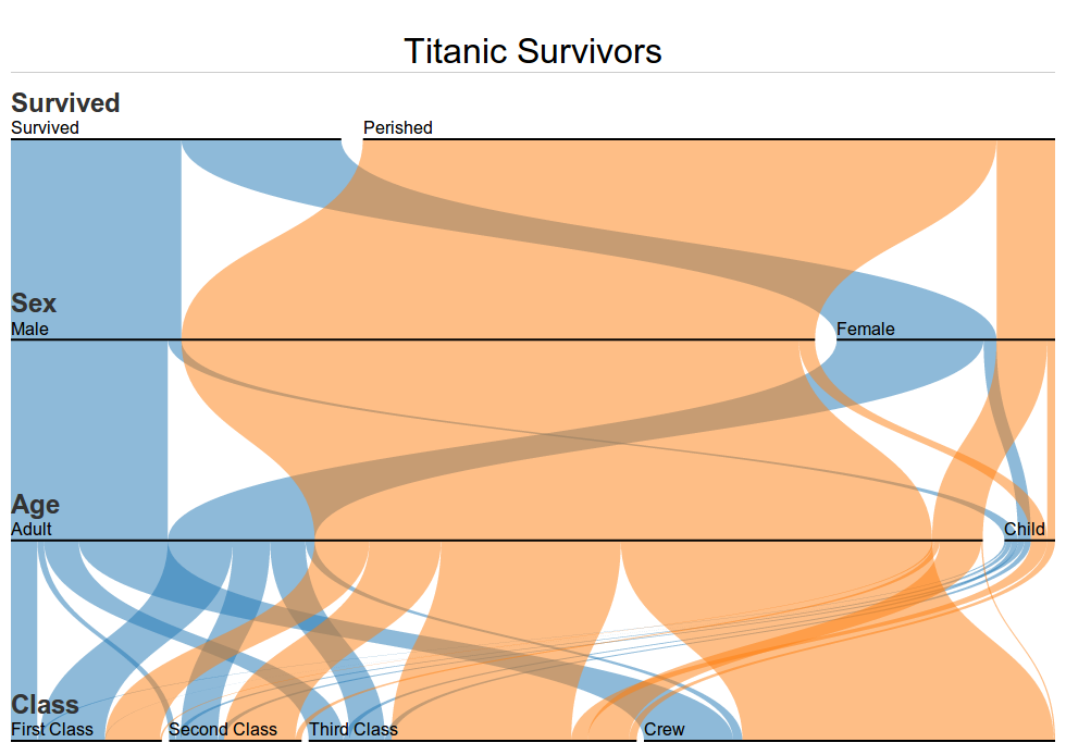 |
| Parallel Sets |
Parallel sets(Parsets) is a visualisation application for categorical data. At first glance, it's not so easy to make sense of the graph. Further analysis and interaction is needed to fully understand the information. It is a powerful representation especially if you want to compare categorical data. The horizontal bars in the visualization show the absolute frequency of how often each category occurred: in this example, the top line shows the distribution between survived and perished when you can see clearly that there are move perished then survived. Each top category can be move up and down and secondary category e.g. male and female can be moved horizontally on the graph.
We can see at a glance that the relative proportion of surviving women is far greater than that of the men. As for children, it becomes clearer when we drag the Age dimension up: around half the children survived. This is proportionally less than the women but more than the men.
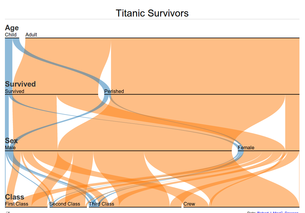 |
| Parallel sets - age dimension at the top |
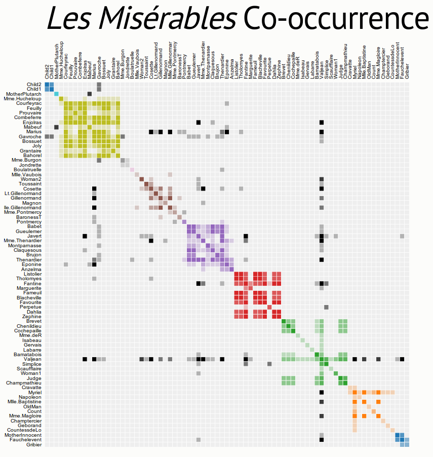 | |||
| Co-occurrence matrix |
This matrix diagram visualizes character co-occurrences in Victor Hugo’s Les Misérables. Each colored cell represents two characters that appeared in the same chapter; darker cells indicate characters that co-occurred more frequently. The matrix can be re-order by using a clustering algorithm.
The effectiveness of a matrix diagram is heavily dependent on the order of rows and columns: if related nodes are placed closed to each other, it is easier to identify clusters and bridges. This type of diagram can be extended with manual reordering of rows and columns, and expanding or collapsing of clusters, to allow deeper exploration. You could also possibly produce a 3D visualisation but needs to be aware of occlusion, interaction complexity, perspective distortion and text legibility. The question of 'when' is most effectively displayed using temporal: animation.
No comments:
Post a Comment